![]()
Matplotlib - Complete Guide
Resources - Github
Chapter 1 - Anatomy of Matplotlib
1.1 Architecture of Matplotlib
Matplotlib has a three-layer architecture: backend, artist, and scripting, organized logically as a stack.
Backend Layer
This is the bottom-most layer where the graphs are displayed on to an output device.There are two types of backends:
- User interface backends| (interactive backends)
- Hard-copy backends to make image files(non-interactive backends)
Artist Layer
This is the middle layer of the stack. Matplotlib uses the artist object to draw various elements of the graph.
Scripting Layer (pyplot API)
This is the topmost layer of the stack. This layer provides a simple interface for creating graphs.
1.2 Elements of a figure
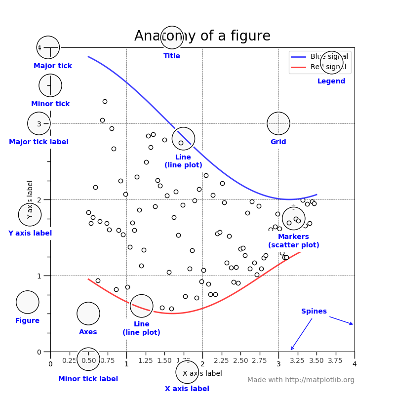
- Axes - is a sub-section of the figure, where a graph is plotted. axes has a title, an x-label and a y-label. A figure can have many such axes
- Axis - number lines representing the scale of the graphs being plotted.(Axis is an element of axes)
- Label - This is the name given to various elements of the figure, for example, x axis label, y axis label, graph label
- Legend
- Title
- Ticklabels
- Spines - boundaries of the figure
- Grid
Interactive Mode - the graph display gets updated after each statement
matplotlib.pyplot.ion()to set the interactive mode ONmatplotlib.pyplot.ioff()to switch OFF the interactive modematplotlib.is_interactive()to check whether the interactive mode is ON (True) or OFF (False)
# set screen output as the backend
%matplotlib inline

import matplotlib as mpl
import matplotlib.pyplot as plt

# Turn on Interactive Mode - interactively adds elements on shell;
# write in separate shells to run in jupyter notebook
plt.ion()
print ('Interactive Mode: ',mpl.is_interactive())

plt.plot([1.5, 3.0])

# Add labels and title
plt.title("Interactive Plot") #Prints the title on top of graph
plt.xlabel("X-axis")         # Prints X axis label as "X-axis"
plt.ylabel("Y-axis")         # Prints Y axis label as "Y-axis"

plt.plot([1.5, 3.0])
plt.plot([3.5, 2.5])
plt.title("Interactive Plot")
plt.xlabel("X-axis")
plt.ylabel("Y-axis")

1.3 Changing and resetting default environment variables
Matplotlib uses the matplotlibrc file to store default values for various environment and figure parameters used across matplotlib functionality.
# Get the location of matplotlibrc file
import matplotlib
matplotlib.matplotlib_fname()
matplotlib.rc('lines', linewidth=4, linestyle='-', marker='*')
matplotlib.rcParams['lines.markersize'] = 20
matplotlib.rcParams['font.size'] = '15.0'
import numpy as np
arr = np.array([[ 1., 1.], [ 2., 4.], [ 3., 9.], [ 4., 16.], [ 5., 25.]])
x = arr[:,0]
y = arr[:,1]
plt.plot(x, y)

Restoring Default values to RC Params
matplotlib.rcdefaults()
plt.plot(x,y)

import pandas as pd
stock = pd.read_csv('https://raw.githubusercontent.com/PacktPublishing/Matplotlib-3.0-Cookbook/master/Chapter02/GOOG.csv', header = None)
stock.columns = ['date','price']
stock.head()
stock['date'] = pd.to_datetime(stock.date, format='%d-%m-%Y')
stock.set_index('date', inplace = True)
plt.plot(stock['price'])

2.2 Bar Plot
import matplotlib.pyplot as plt
import numpy as np
import calendar

month_num = [1, 2, 3, 4, 5, 6, 7, 8, 9, 10, 11, 12]
units_sold = [500, 600, 750, 900, 1100, 1050, 1000, 950, 800, 700, 550, 450]

fig, ax = plt.subplots()
plt.xticks(month_num, calendar.month_abbr[1:13], rotation = 0)
plot = ax.bar(month_num, units_sold)
for rect in plot:
    ax.text(rect.get_x() + rect.get_width()/2, rect.get_height()+10,str(int(rect.get_height())), ha = 'center', va = 'bottom')

plot2 = plt.barh(month_num, units_sold)
plt.yticks(month_num, calendar.month_name[1:13], rotation=0)
for rect in plot2:
    plt.text(rect.get_width() + 10, rect.get_y()+rect.get_height()/2, str(int(rect.get_width())),  va = 'center')
plt.show()

2.3 Scatter Plot
age_weight = pd.read_excel('https://github.com/PacktPublishing/Matplotlib-3.0-Cookbook/blob/master/Chapter02/scatter_ex.xlsx?raw=true')
plt.figure(figsize=(10,6))
x = age_weight['height']
y = age_weight['weight']
plt.scatter(x, y)
plt.xlabel('Height')
plt.ylabel('Weight')
plt.show()

iris = pd.read_csv('https://raw.githubusercontent.com/PacktPublishing/Matplotlib-3.0-Cookbook/master/Chapter02/iris_dataset.csv')
iris.head()
# each class of species is defined with descriptive names, which we will map to numeric codes as 0, 1, or 2
iris['species'] = iris['species'].map({"setosa" : 0, "versicolor" : 1, "virginica" : 2})
# c does not take non numeric arguments
plt.scatter(iris.petal_length, iris.petal_width, c=iris.species)
plt.xlabel('petal length')
plt.ylabel('petal width')
plt.show()

2.4 Bubble Plot
It is a manifestation of the scatter plot, where each point on the graph is shown as a bubble. Each of these bubbles can be displayed with a different color, size, and appearance.
plt.scatter(x = iris.petal_length,
            y = iris.petal_width,
            s = 25*iris.petal_length * iris.petal_width, # specifies the size of the bubble
            c = iris.species, # specifies different classes (clusters) in the data.
            alpha = 0.3) # transparency of the bubble
plt.show()

2.5 Stacked Plot
A stacked plot represents the area under the line plot, and multiple line plots are stacked one over the other. It is used to provide a visualization of the cumulative effect of multiple variables being plotted on the y axis.
# data
x = np.arange(6)+1
Apr = [5, 7, 6, 8, 7, 9]
May = [0, 4, 3, 7, 8, 9]
June = [6, 7, 4, 5, 6, 8]
labels = ["April", "May", "June"]
fig, ax = plt.subplots()
ax.stackplot(x, Apr, May, June, labels=labels)
ax.legend(loc=2) # specifies the legend to be plotted in the top left of the graph

plt.xlabel('defect reason code')
plt.ylabel('number of defects')
plt.title('Product Defects - Q1 FY2019')

plt.show()

2.6 Pie Chart
A pie plot is used to represent the contribution of various categories/groups to the total.
labels = ['SciFi', 'Drama', 'Thriller', 'Comedy', 'Action', 'Romance']
sizes = [5, 15, 10, 20, 40, 10] # Add upto 100%
explode = (0, 0, 0, 0, 0.1, 0) # only "explode" the 5th slice (i.e.'Action')
plt.pie(sizes,
        labels = labels,
        explode = explode,
        autopct = '%1.1f%%',
        counterclock = False,
        startangle = 90)
plt.show()

2.7 Table Chart
A table chart is a combination of a bar chart and a table, representing the same data. So, it is a combination of pictorial representation along with the corresponding data in a table.
rows = ['2011', '2012', '2013', '2014', '2015']
columns = ('7Ah', '35Ah', '40Ah', '135Ah', '150Ah')
data = [[75, 144, 114, 102, 108],
        [90, 126, 102, 84, 126],
        [96, 114, 75, 105, 135],
        [105, 90, 150, 90, 75],
        [90, 75, 135, 75, 90]]
values = np.arange(0, 600, 100)
colors = plt.cm.OrRd(np.linspace(0, 0.5, len(rows)))
index = np.arange(len(columns))
bar_width = 0.5
y_offset = np.zeros(len(columns))
y_offset
fig, ax = plt.subplots()
cell_text = []
n_rows = len(data)
for row in range(n_rows):
    plot = plt.bar(index, data[row], bar_width, bottom=y_offset,
                   color=colors[row])
    y_offset = y_offset + data[row]
    cell_text.append(['%1.1f' % (x) for x in y_offset])
    i=0
# Each iteration of this for loop, labels each bar with corresponding value for the given year
    for rect in plot:
        height = rect.get_height()
        ax.text(rect.get_x() + rect.get_width()/2, y_offset[i],'%d'
                % int(y_offset[i]),
                ha='center', va='bottom')
        i = i+1
the_table = plt.table(cellText=cell_text, rowLabels=rows,
                rowColours=colors, colLabels=columns, loc='bottom')
plt.ylabel("Units Sold")
plt.xticks([])
plt.title('Number of Batteries Sold/Year')
plt.show()

2.8 Polar Plot (spider Chart)
The polar plot is a chart plotted on the polar axis, which has coordinates as angle (in degrees) and radius, as opposed to the Cartesian system of x and y coordinates
Depts = ["COGS","IT","Payroll","R & D", "Sales & Marketing"]
rp = [30, 15, 25, 10, 20, 30] # planned expenses
ra = [32, 20, 23, 11, 14, 32] # actual spending

theta = np.linspace(0, 2 * np.pi, len(rp))
The pyplot method accepts only radians as input, hence we need to divide 2 x np.pie (which is equivalent to 360 degrees) radians into number of departments equally, to get the angle coordinates for each of the departments
plt.figure(figsize=(10,6))
plt.subplot(polar=True)
(lines,labels) = plt.thetagrids(range(0,360, int(360/len(Depts))), (Depts))
plt.plot(theta, rp)
plt.fill(theta, rp, 'b', alpha=0.1)
plt.plot(theta, ra)
plt.show()

2.9 Histogram
Continuous variable values are split into the required number of bins and plotted on the x axis, and the count of values that fall in each of the bins is plotted on the y axis. On the y axis, instead of count, we can also plot percentage of total, in which case it represents probability distribution.
import matplotlib.pyplot as plt
import numpy as np
grp_exp = np.array([12, 15, 13, 20, 19, 20, 11, 19, 11, 12, 19, 13, 12,
                    10, 6, 19, 3, 1, 1, 0, 4, 4, 6, 5, 3, 7, 12, 7, 9,
                    8, 12, 11, 11, 18, 19, 18, 19, 3, 6, 5, 6, 9, 11,
                    10, 14, 14, 16, 17, 17, 19, 0, 2, 0, 3, 1, 4, 6,
                    6, 8, 7, 7, 6, 7, 11, 11, 10, 11, 10, 13, 13, 15,
                    18, 20, 19, 1, 10, 8, 16, 19, 19, 17, 16, 11, 1,
                    10, 13, 15, 3, 8, 6, 9, 10, 15, 19, 2, 4, 5, 6, 9,
                    11, 10, 9, 10, 9, 15, 16, 18, 13])
plt.figure(figsize=(10,6))
nbins = 21
n, bins, patches = plt.hist(grp_exp, bins = nbins)
plt.xlabel("Experience in years")
plt.ylabel("Frequency")
plt.title("Distribution of Experience in a Lateral Training Program")
plt.axvline(x=grp_exp.mean(), linewidth=2, color = 'r')
plt.show()

nis the list containing the number of items in each bin,binsis another list specifying starting point of the bin, andpatchesis the list of objects for each bin.
Density Plot
plt.figure(figsize=(10,6))
nbins = 21
n, bins, patches = plt.hist(grp_exp, bins = nbins, density=1)
plt.xlabel("Experience in years")
plt.ylabel("Percentage")
plt.title("Distribution of Experience in a Lateral Training Program")
mu = grp_exp.mean()
sigma = grp_exp.std()
y = ((1 / (np.sqrt(2 * np.pi) * sigma)) * np.exp(-0.5 * (1 / sigma * (bins - mu))**2))
plt.plot(bins, y, '--')
plt.show()

2.10 Box Plot
It visually shows the first and third quartile, median (mean), and whiskers at 1.5 times the Inter Quartile Range (IQR)—the difference between the third and first quartiles, above which are outliers. The first quartile (the bottom of rectangular box) marks a point below which 25% of the total points fall. The third quartile (the top of rectangular box) marks a point below which 75% of the points fall.
import matplotlib.pyplot as plt
import pandas as pd
wine_quality = pd.read_csv('https://raw.githubusercontent.com/PacktPublishing/Matplotlib-3.0-Cookbook/master/Chapter02/winequality.csv', delimiter=';')
wine_quality.head()
data = [wine_quality['alcohol'], wine_quality['fixed acidity'],
        wine_quality['quality']]
plt.figure(figsize=(10,6))
plt.boxplot(data)
plt.show()

- The
dataargument can be a list of one or more attributes. - The yellow line in each box represents the median value of the attribute by default
- The bottom line of the box is at the first quartile, and the upper line of the box is at the third quartile of the data.
Horizontal Box plot
- vert=False argument, you can plot the box plots horizontally
- by specifying the
showfliers = Falseargument, you can suppress the outliers, so it plots only up to the whiskers on both sides.
plt.boxplot(data, vert=False, flierprops=dict(markerfacecolor='r', marker='D'))
plt.show()

plt.boxplot(data, vert=False, showfliers=False)
plt.show()

2.11 Violin Plot
The violin plot is a combination of histogram and box plot. It gives information on the complete distribution of data, along with mean/median, min, and max values.
data = [wine_quality['alcohol'], wine_quality['fixed acidity'], wine_quality['quality']]
plt.figure(figsize = (10,6))
plt.violinplot(data, showmeans=True)
plt.show()

- The bottom whisker is the minimum value,
- the top whisker is the maximum value, and
- the horizontal line is at the mean value.
showmedian = True, we can have a horizontal line representing the median of the data instead of the mean
2.11 Reading and Displaying Images
Matplotlib.pyplot has features that enable us to read .jpeg and .png images and covert them to pixel format to display as images.
import matplotlib.pyplot as plt
plt.figure(figsize = (10,6))
image = plt.imread('C:/Users/sumit kant/Pictures/Wallpapers/apple_mac_os_x_el_capitan-3840x2160.jpg')
plt.imshow(image)
plt.show()

print("Dimensions of the image: ", image.shape)
2.12 Heatmap
Matplotlib.pyplot has features that enable us to read .jpeg and .png images and covert them to pixel format to display as images.
import matplotlib.pyplot as plt
import pandas as pd
wine_quality = pd.read_csv('https://raw.githubusercontent.com/PacktPublishing/Matplotlib-3.0-Cookbook/master/Chapter02/winequality.csv', delimiter=';')
wine_quality.head(3)
corr = wine_quality.corr()
plt.figure(figsize = (10,8))
plt.imshow(corr, cmap = 'viridis')
plt.colorbar()
plt.xticks(range(len(corr)), corr.columns, rotation = 90)
plt.yticks(range(len(corr)), corr.columns)
plt.show()

2.13 Hinton Diagram
- for visualizing weight matrics in deep learning applications
import numpy as np
import matplotlib.pyplot as plt
import pandas as pd
matrix = np.asarray((pd.read_excel('https://github.com/PacktPublishing/Matplotlib-3.0-Cookbook/blob/master/Chapter02/weight_matrix.xlsx?raw=true')))
fig, ax = plt.subplots()

ax.patch.set_facecolor('gray')
ax.set_aspect('equal','box')
ax.xaxis.set_major_locator(plt.NullLocator()) #ets the x axis ticks to nulls
ax.yaxis.set_major_locator(plt.NullLocator())

max_weight = 2 ** np.ceil(np.log(np.abs(matrix).max()) / np.log(2))

for (x, y), w in np.ndenumerate(matrix):
    color = 'white' if w > 0 else 'black'
    size = np.sqrt(np.abs(w) / max_weight)
    rect = plt.Rectangle([x - size / 2, y - size / 2], size, size, facecolor=color, edgecolor=color)
    ax.add_patch(rect)
ax.autoscale_view() #arranges all the boxes neatly and plots the Hinton diagram.

plt.show()

2.14 Contour Plot
typically used to display how the error varies with varying coefficients that are being optimized in a machine learning algorithm
import matplotlib.pyplot as plt
import pandas as pd
import numpy as np
from matplotlib import cm
Loss = pd.read_excel('https://github.com/PacktPublishing/Matplotlib-3.0-Cookbook/blob/master/Chapter02/Loss.xlsx?raw=true')
theta0_vals = np.linspace(-10, 10, 100)
theta1_vals = np.linspace(-1, 4, 100)
fig = plt.figure(figsize=(12,8))
X, Y = np.meshgrid(theta0_vals, theta1_vals)
CS = plt.contour(X, Y, Loss, np.logspace(-2,3,30),
                 cmap=cm.coolwarm)
plt.clabel(CS, inline=1, fontsize=10)

# Plot the minimum point(Theta at Minimum cost)
plt.plot(theta0_vals[Loss.min(axis= 0).idxmin()],
         theta1_vals[Loss.min(axis= 1).idxmin()], 'rx', markersize=15, linewidth=2)

plt.show()

- np.logspace(-2,3,20) specifies the range of values on a logarithmic scale for the Loss attribute, which needs to be drawn on a contour plot. On a linear scale, this range will be from 0.01 (10 to the power of -2) to 1,000 (10 to the power of 3). And 20 is the number of samples it draws in this range, using which contours are plotted.
2.15 Triangulations
Triangulations are used to plot geographical maps, which help with understanding the relative distance between various points. The longitude and latitude values are used as x, y coordinates to plot the points.
import numpy as np
import matplotlib.pyplot as plt
import matplotlib.tri as tri
data = np.random.rand(50, 2)
triangles = tri.Triangulation(data[:,0], data[:,1]) #creates triangles automatically
plt.figure(figsize=(10,6))
plt.triplot(triangles)
plt.show()

xy = np.array([[-0.101, 0.872], [-0.080, 0.883], [-0.069, 0.888],
               [-0.054, 0.890], [-0.045, 0.897], [-0.057, 0.895],
               [-0.073, 0.900], [-0.087, 0.898],
               [-0.090, 0.904], [-0.069, 0.907]])
x = np.degrees(xy[:, 0])
y = np.degrees(xy[:, 1])
triangles = np.array([[1, 2, 3], [3, 4, 5], [4, 5, 6], [2, 5, 6],
                      [6, 7, 8], [6, 8, 9], [0, 1, 7]])
plt.figure(figsize=(10,6))
plt.title('triplot of user-specified triangulation')
plt.xlabel('Longitude (degrees)')
plt.ylabel('Latitude (degrees)')
plt.triplot(x, y, triangles, 'go-', lw=1.0)
plt.show()

2.16 Stream Plot
known as streamline plots are used to visualize vector fields. They are mostly used in the engineering and scientific communities
import numpy as np
import matplotlib.pyplot as plt
import matplotlib.gridspec as gridspec
x, y = np.linspace(-3,3,100), np.linspace(-2,4,50)
X, Y = np.meshgrid(x, y)
U = 1 - X**2
V = 1 + Y**2
plt.figure(figsize=(10,6))
plt.streamplot(X, Y, U, V)
plt.title('Basic Streamplot')
plt.show()

- U and V are velocity vectors as a function of x and y.A stream plot is a combination of vectors x, y and velocities U and V
- We can control the density and thickness as functions of the speed and color of the stream lines. Here is the code and its output:
# Define the speed as a function of U and V
speed = np.sqrt (U*U + V*V)
plt.figure(figsize= (10,6))

# Varying line width along a streamline
lw = 5 * speed / speed.max()

strm = plt.streamplot(X, Y, U, V, density=[0.5, 1], color=V,
                      linewidth=lw)
plt.colorbar(strm.lines)

plt.title('Varying Density, Color and Line Width')

plt.show()
